Texture Tools and Material Magic: What Clay and Glaze Reveal
Exploring Texture: How Relyef Tools Interact with Different Clays and Glazes
At Relyef, we love experimenting. In the spirit of improving our tools and helping you get the most out of them, we’ve been exploring how different materials affect the final look of your work when using our stamps and rollers.
Whether you’re working with smooth porcelain or gritty grogged clay, the same tool can produce dramatically different results. That’s part of the magic—and part of the fun.
Surface Matters: Clay Bodies and Texture
Let’s start with the clay itself. A fine porcelain body will give you incredibly crisp and delicate impressions—perfect for when you want subtle detail. When combined with a transparent glaze, the result can be ethereal, like a soft echo of the design beneath the surface.
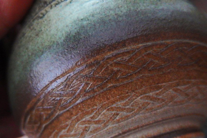
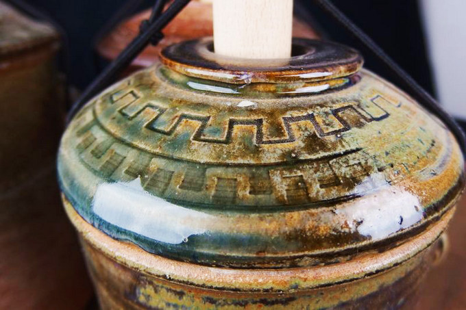
But try that same tool on a coarse, grogged clay (like a heavily chamotted stoneware), and you’ll see a bolder, more rustic texture. The relief becomes deeper, the surface more expressive. And depending on your glaze, the impression might catch more or less glaze depending on the surface texture, bringing out details you didn’t expect.
Glaze: A Story of Contrast
Glazes, of course, add another layer to the story. A thick, creamy glaze can soften the edges of your relief on grogged clay—almost like snow gathering in a carved landscape.
Or take Shino glazes: in a deep relief, they pool and develop rich, dramatic color; on a smooth or shallow surface, they remain thin, giving a completely different effect.
Celadons and feldspathic glazes are also worth exploring. On jar forms we tested, these glazes created beautiful contrasts depending on the depth of the texture. Reduction-fired at 1300°C, the results were stunning—especially where the glazes settled into the deeper parts of the relief.

Reversing the Design: Positive vs. Negative
One of the most surprising discoveries comes when you use the same design in reverse. A positive version might highlight the motif as a raised texture, while the negative version pushes it into the clay. They’re technically the same design—but visually and tactilely, they feel worlds apart.
This gives you endless creative freedom. Want something subtle and soft? Try a shallow, positive texture on porcelain. Looking for bold contrast? Go for a deep negative relief with a glaze that runs.

Big or Small? Deep or Shallow? Sharp or Soft?
So… which is better?
A big or small pattern? A deep or shallow relief? Sharp lines or soft transitions? Positive or negative?
Well, that depends entirely on your clay, your glaze, your firing temperature—and, of course, your artistic vision.
We hope this inspires you to experiment. The combinations are endless, and that’s exactly why we make our tools: to give you the freedom to explore, play, and create something that’s truly yours.


