Project Alphabet
How to Sign and Personalize Pottery with Stamps That Won’t Clog
You spend an hour shaping a beautiful mug. Then comes the final step: adding your signature. You grab a needle tool or toothpick, carve into the surface, and end up with something that looks like a doctor's hurried prescription after firing.
It is the single most common scene in ceramic workshops. Studio instructors spend half their class helping students fix jagged, messy lettering, only for the final piece to look worse than if it had been left blank.
When I founded ARTkeramika.cz back at the turn of the millennium and wrote the first of over a thousand technical articles, I had a single mission: to help makers build confidence and joy in their craft. Today, our tools ship from Brno to dozens of distributors worldwide - from the US and UK to Poland and New Zealand. And the product that started it all was this very stamp set.
We were the first in the world to introduce clay alphabet stamps in their modern form. Unlike most claims in marketing, this one is backed by verifiable dates.
The Draft Angle: The Tiny Engineering Detail That Changes Everything
This is the part you will not find anywhere else, because you only learn it after pressing a stamp into clay a thousand times.
When people first experimented with 3D-printing lettering on home printers, they made a fatal design mistake: vertical, straight-walled lettering. Wet clay clung to the sharp interior corners, filling up the recess. With every impression, the lettering grew blurrier. By the third stamp, you were sitting there with a needle tool, manually digging wet clay out of the letters.
Our alphabet sets feature a precise draft angle (tapered conical walls). The letter tapers slightly toward the cutting edge, meaning the clay literally cannot wedge itself inside. It releases smoothly on its own. The result? Every single impression stays razor-sharp, and the tool remains clean even at the end of a long workshop with twenty students.
It is a minor visual detail when looking at a catalog, but in actual studio practice, it is the difference between a tool that works and one that ends up tossed in the water bucket after an hour.
Verifiable Origins
It is easy to claim "we were first," so here is the hard paper trail. We sold our first set back in 2016 through ARTkeramika.cz under the Rélyéf brand, using the exact structural design we manufacture today. On June 22 of that same year, we filed our trademark application with the Czech Industrial Property Office (File OZ/532124); anyone can verify the filing date in the public register. We later transferred all manufacturing under Relyef Pottery Tools s.r.o. in November 2020.
"A decade spent refining a single tool" is not a marketing tagline. It is the real reason our letter walls feature that exact draft angle.
Choosing the Right Type Size
We manufacture our sets in five distinct sizes. Picking a size is not just cosmetic - it dictates whether your text remains legible after glazing:
-
4 mm: Ideal for maker marks on the base, delicate jewelry, and small pendants. Our finest profile; requires a smooth clay body without coarse grog. This set includes a dedicated organizer, as tiny stamps disappear off studio tables in seconds.
-
6 mm: Perfect for signatures, small name tags, and glaze test tiles. Excellent balance between crisp legibility and subtle design.
-
10 mm: Our most versatile, all-around workhorse. Great for mug dedications, decorative tiles, or student name tags. If you are unsure where to start, pick this size.
-
26 mm: Designed for door plaques, house numbers, architectural ceramics, or bold sculptural lettering where text acts as the main decorative motif.

Rule of Thumb: The coarser the clay, the larger the font size you need. A 4 mm stamp will fail in heavily grogged fireclay; coarse grit particles will push against the fine edge of the letter, creating jagged lines.
How to Stamp Lettering That Survives Firing
Here is the five-step process we teach first in our workshops:
-
Hit the Sweet Spot for Clay Consistency. This accounts for 80% of your success. Clay that is too soft will squeeze out around the stamp, forming a messy ridge around the letter. Clay that is too dry will crack. Look for the stage where a light thumb impression leaves a mark without cracking the edge - the slab holds its shape but retains memory.

-
Support Your Work with a Rigid Surface. Always stamp over a firm, hard backing board - never over soft foam or in mid-air. Without solid backing pressure, the impression ends up shallow in the middle and deep along the outer edges. (If stamping a hollow vessel, support the inner wall directly behind the stamp with your fingers.)
-
Dry-Fit Your Layout First. The most common workshop error is starting at the left edge and running out of space for the last three letters. Lay your stamps side-by-side on the workbench, measure the overall width, and plan your placement. For short words, work outward from the center letter in both directions.
-
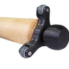
One Firm Press Straight Down - No Rocking. Place the stamp, apply firm downward pressure in a single motion, and pull it straight up. Any side-to-side rocking will smear the profile. The wooden Handle for Clay Stamps included with every set provides consistent vertical leverage rather than pinching small edges with your fingertips.
-
Dry Cleaning Only. Remove dry clay dust from stamp cavities using a stiff, dry brush. Never scrape the interior walls with a knife or needle tool - scratching the delicate edges will cause clay to catch in that groove on every subsequent press.
Tip: Deep stamping looks striking on raw, unglazed clay, but a thick glossy glaze will flood the impression and erase the letter. If you plan to apply a glossy finish, press more shallowly and highlight the lettering using a stain or underglaze wiped back from the surface after drying. Always test your glaze-and-clay combination first!
American Raku firing at 1120°C: The extreme reduction environment created a vibrant metallic surface where the sharp conical edges of the embossed year MMXV perfectly retain their legibility and shape.

From the Relyef Workshop
Tomáš explains: “We worked out the draft angle before we ever put a set up for sale. We tested various wall angles to find the exact threshold where clay releases effortlessly while the letter retains its crisp, razor-sharp edge. That angle is the whole secret - everything else is just typography.”
Věra adds: “During my time learning in studios across India and Switzerland, I noticed that anywhere people pay good money for a workshop, personalization is essential. Every student wants to sign their piece or make a gift with a custom message. With an alphabet set, even someone holding clay for the first time creates a clean, professional inscription - and that instant success boosts their confidence for the rest of the class.”

Diacritics, Cyrillic, and Runes: Pottery Knows No Borders
Every Latin set includes a combined punctuation and diacritics stamp. It sounds like a minor addition, but for anyone writing in Czech, German, Polish, or Hungarian, it is the difference between "Tomas" and "Tomáš".
Beyond our standard Latin typography, we produce specialty sets you won't find anywhere else:
-
Tahoma Cyrillic Alphabet Stamps - including dedicated Ukrainian character sets that integrate seamlessly.

-
Elder Futhark Rune Stamps and Celtic Ogham Stamps - for historic and mythology-inspired work.

-
Specialty Nordic and German extensions (ä, ö, ü, ß, æ, ø, å) designed to match our Courier Alphabet Stamps.
-
Lithos Mirrored Alphabet Stamps - reversed lettering designed for pressing into plaster molds or creating raised relief text on cast pieces. Perfect for custom ceramic seals.

We offer our alphabets across multiple type families - serif, sans-serif, script, and historic blackletter (including Courier Alphabet Stamps, Futura Alphabet Stamps, Marion Alphabet Stamps, Lithos Alphabet Stamps, Script Alphabet Stamps, and Schwabach Alphabet Stamps). A rustic stoneware mug demands a completely different typographic voice than a minimalist porcelain vase.

When Stamps Are Not the Right Tool
To offer genuine technical advice, we have to talk about limitations observed in the studio:
-
Tight Cylinders and Small Radii. Flat stamps do not seat cleanly against tight curved surfaces - only the center of the letter makes full contact. The Fix: Stamp your text onto the flat clay slab before constructing the vessel.
-
Extremely Coarse Fireclay. Ultra-fine letter profiles simply cannot bridge heavy grog particles. Switch to 10 mm or 26 mm lettering, or press your text onto a thin, smooth clay plaque and attach it to the piece.
-
Bone-Dry or Hard Clay. Leather-hard or bone-dry clay will not accept a clean impression. At that stage, use a sgraffito tool, underglaze pencil, or oxide wash instead of a stamp.
A tool that acknowledges its physical limits is far more useful than one promising magic results everywhere.
Three Studio Applications That Pay Off Immediately
-
Glaze Test Tile Labeling. The most underutilized trick in the studio. Stamp glaze names, codes, or firing temperatures directly into raw clay test tiles before firing - creating an indelible reference mark that won't peel, fade, or wash off. (Pair these with our Courier Number Stamps or Futura Number Stamps for clean recipe tracking).

-
High-Margin Experience Workshops. "Make a Custom Family Plaque" or "Personalized Door Sign" rank among the highest-selling introductory workshops globally. Crisp lettering tools ensure beginners leave with a professional-looking finished piece they are proud to show off - driving word-of-mouth recommendations.

-
Consistent Studio Branding. Stamping your signature or brand name on the base of every piece is the simplest, most cost-effective marketing in ceramics.
Studio Tip: A standard set contains 26 letter stamps plus accessories. Without an organizational system, pieces end up scattered across worktables in minutes. We developed custom Organisers for Clay Stamps and Box with Organisers for Clay Stamps (available in 18, 27, or 36 slots) to keep studio workspaces orderly. In a workshop with ten students, organized storage is a necessity.
Desk organization in action: The 3D-printed organizer keeps all 27 characters of the set neatly sorted, so individual pottery stamps won't get lost during creation in a workshop or studio.

Join the Community
How do you handle signing your work in the studio? Have you found a specific clay body that holds micro-details best? Or do you have a favorite trick for keeping your lettered lines perfectly straight?
Drop your thoughts in the comments below. Věra and I read every response and are always happy to troubleshoot technical questions - our Čertovina training studio exists so we can run these tests and pass the results on to you.
Ready to bring clean, precise lettering to your pottery?
-
For Potters & Hobbyists: Explore our full range of Alphabet Stamps, Number Stamps, and special scripts to find the ideal size and typeface for your work.
-
For Studio Owners, Schools & Instructors: Equip your studio for personalization workshops and join the Relyef Studio Partner Program (RSPP). Gain 20% off studio equipment, 10% discount codes for your students, and a 10% commission for your studio.
-
For Distributors & Retailers: Interested in stocking our original stamp sets? Reach out to our B2B team for wholesale details.
This is Part 2 of our studio workshop project series. Check out Part 1 (Little Houses) and stay tuned for Part 3 (Ocarina Moulds)!
-
Posted in
ceramics, class, clay, creative, kvevri, pottery, Relyef, texture, textured clay, textures, workshop